So I have been spending a lot of time learning and working with divs for the homepage
It's taking me a lot of getting used to and the current design is not exactly where I want it to be but its getting there
I've also looked into getting a feed for the front page of the latest forum post but its proving difficult and it's going to take more time than I imagined to get that working.
I did find an antispam mod that seems to be working. I've been porn free for the last couple days so im pretty excited about that.
I've decided to throw out my original banner and I'll be getting a new one out with the updated color scheme.
My biggest problem outside of design and tech stuff seems to be getting committed and dedicated users since the commitment level is pretty high for the average user. I think I will need to advertise a bit more and maybe ask some of the younger students in new media if they are interested and willing to try this out. The problem is its really up to the users if they want to commit to it and since there are very few clients looking for work at the moment its hard to get people motivated.
Wednesday, April 9, 2008
Sunday, March 30, 2008
Feedback Info
The following is a few questions I sent to some online friends and RL friends after asking them to take a look or post to BusiGo
BusiGo.org Feedback Sheet
1.Is the purpose of the site clearly stated?
2.Is the design appealing?
3.Would you find this site useful for you?
4.What features would you like to see implemented?
5.How would you suggest I get the word out about BusiGo.org?
User - Sovelis
1. yes
2. I think the design needs some work.
3. Yeah, I could see myself using a site like this when it gets populated.
4. Not sure on features I would like for this idea.
5. You could get more friends to post, I think it will be easier to get the word out when there are some example posts people can see to get started.
User - GT
1.Yes, it's pretty clear that it's a good place for collaborating about creating web sites
2.I like the opening page design.
3.Yes, in fact I have used it in the past to get help
4.I would like to see more examples, like a gallery of websites that people participating on the site have designed .
5.I think the best way is to post and advertise on sites where there are a lot of developers and web designers like http://www.slashdot.com or http://freshmeat.net.
User - Einahpets
1. Yeah.
2. The front page could be better, the banner could be redone.
3. I'm not sure I would use the site, but it is an interesting idea.
4. Maybe a way to rate users on how useful their responses were.
5. I'd consider posting to more design communities online like deviantart or something, not sure about getting business though.
User - Susan
1.Yes
2. Yes
3.Yes, I received some advice already and I plan to use the site again.
4. A place to show finished sites or designs made by collaborators on the site.
.5 Advertising online may be the best option since that is where the potential users are.
Tuesday, February 26, 2008
Capstone Identifications!
Audience!
a. Ideal target audience is up and coming business owners, team and club organizers, and designers looking to get established.
b. User's I have access to that I will be soliciting are friends and family members, online friends, and the new media department.
Deployment!
a. I'll be adding the current release to the pool
Promotion!
a. I'll add a request for participation on the pool
b. I'll be posting posters around campus to solicit users
c. I'll add a link of busigo.org to my FC sig
Feedback!
a. Pool reviews
b. Online forum posts
Feedback Summary!
a. Pool reviews
b. Forum posts
Tuesday, February 19, 2008
Sunday, February 17, 2008
3rd Milestone

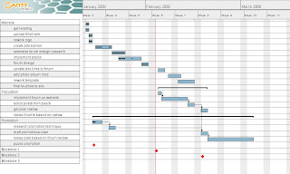
As seen in my gantt chart My site is very nearly done, the next step for users on the site is ready.
I've been trying to get some friends to start posting so I can get some content.
I'm happy with how its come out so far. I've been playing with templates for the site and trying to edit the css myself making small changes im looking for but some things have just been taking a lot of time. I'm not quite happy with the banner and it took a long time to get it positioned where it is.
The biggest hurdle I had to overcome was getting the album mod to work with a different template than the standard subsilver one. A lot of the directions were made specific to subsilver which I had to work around and edit some of the code involved (a lot of this became trial and error and took forever) I think its all working correctly now though.
Other than the album mod and template work I've done I also tried incorporating the free phpbb template to work with the actual busigo site that isnt connected to the forums. This was one of the main goals I had this milestone. busigo.org and the forum site still feel a little off but that should only take some more template tinkering and editing to my personal tastes.
Luckily all the functionality I was hoping for has finally clicked together and the cosmetic tinkering can be done while work with incoming content is gathered.
Sunday, February 3, 2008
Second Milestone Review
For my second milestone review I will be showing the current forum I've implemented to my site using phpBB. I had a lot of trouble actually getting it installed but some help from Alex let me get it up and working and I've been learning quite a lot as I've been going.
I wasn't able to completely have the site working at this point as I would have liked and I have reflected my gantt chart to show this. I pushed a few tasks into the next milestone area along with the promotion part. This was needed as a few new tasks came up such as implementing a photo gallery to support the design side of the forums. This also pushed back putting finishing touches on the site.
I don't foresee this being a problem because originally I intended the next milestone to cover promotion solely which should not be hard to do simultaneously with finishing off the site.
What I do have ready for this review is the forum ready to be posted to and the main site BusiGo.org links now bring you to the selected forum areas.
What I will need in the upcoming weeks from my classmates is posts to work with as I can accept content with the current state of the site and forums. If anyone in class is interested in the service this site will provide feel free to try it out and create a post.
Subscribe to:
Comments (Atom)

